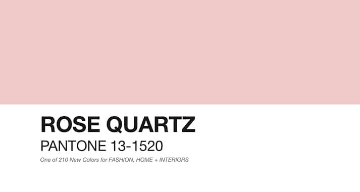
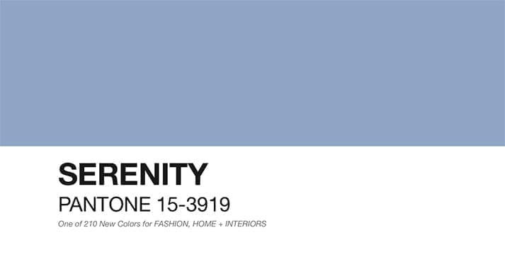
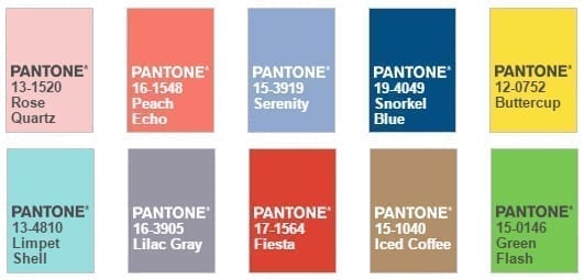
Rose Quartz and Serenity. Pantone colours for next 2016
Rose quartz and Serenity or what is the same PANTONE 13-1520 and PANTONE 15-3919 will be the colours that will set the trend in 2016.
For the first time in its history, the selection includes two shades. Pantone aims for a calmer approach to colour, at a time when buyers value well-being and seek an antidote to the stresses of modern life.
“The combination of Serenity and Rose Quartz embodies the inherent balance between the warmer pink tone and the tranquillity of the coldest blue, to reflect a state of connection and well-being, and a calming feeling of order and peace.”
What or who is Pantone?
Pantone Inc. is an American corporation/company based in Carlstadt, New Jersey. A whole authority in the field of colour; creator of the Pantone Matching System, colour identification, comparison, and communication system.
Its internationally known Pantone Guides unlike CMYK and RGB modes are samples of solid colour prints essential for the graphic arts.
Since 2000, its annual report includes the selection of the colour of the year, marking industry guidelines and influencing great fashion designers, interior designers, or makeup artists.
How is the Pantone color of the year chosen?
Last year, when Marsala conditioned the market; Carola Seybold, director of Pantone Europe, mentioned that Leatrice Eiseman, executive director; Laurie Pressman, Vice President and David Shah, Editorial Director; and a group of 40 experts from around the world, were responsible for the choice of colour of the year.
The social and economic moment, videos, music, and films in production, as well as the contribution of ideas from important companies consulted and the psychology of colour; come into play to establish the chromatic trend of the year.
Once the specific tone is chosen, it is vital that its meaning has no negative connotations anywhere in the world.
The design and fashion sector will give up on the charm of quartz rose and Serenity Blue.
How to use Pantone 2016 color in decoration?
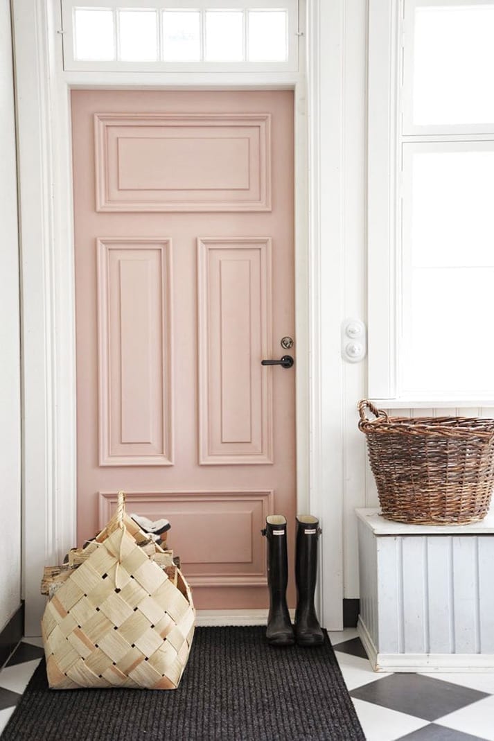
At home.
Once you have known the new colours that will set trends, if you are one of those who like to follow the fashions, putting the decoration of the home up to date is possible without the need for large budgets. We recommend selecting a neutral colour palette that includes white, stone grey and sand tones; to be able to incorporate the star colours.
Surely the new shades will soon be available in the collection of paintings of the Spanish brand ALP selected by Pantone, to distribute a range of 32 colours, exact reproductions of the Pantone menu, available exclusively in the stores of Leroy Merlin.
The collection of paintings “ALP Inspired by Pantone”, is updated following the evolution of trends in decoration and has the exclusive design directly associated with The Iconography of Pantone.
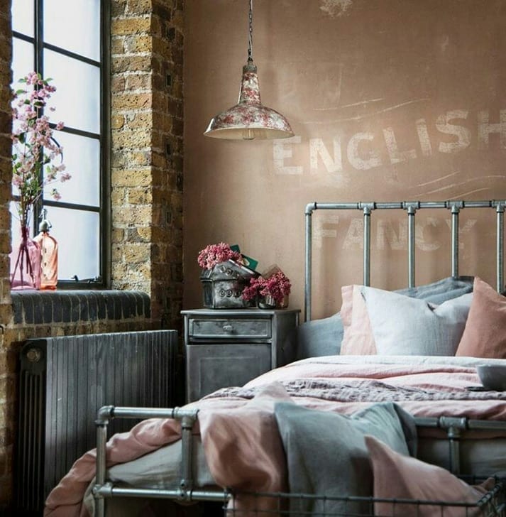
Fashion trends are cyclically monitored. What was once current, a period of hibernation passes before it becomes topical again. The wallpaper, essential in the 40s, is back in fashion and becomes a good decorative resource when updating spaces, revaluing the identity of the same, at a minimum cost.
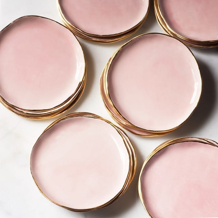
Without a large disbursement, renewing crockery, household clothing such as blankets, Nordic covers and cushions; including some natural flowers or replacing small appliances and electronics, will suffice.
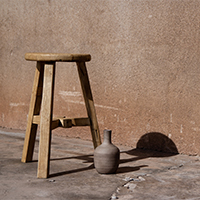
In addition, the industrial style, of a colder and tougher character than other decorative styles sweeter and softer, but not less elegant; can be mitigated by incorporating the new pastel shades.
In the commercial decoration.
In the case of the decoration of commercial spaces, the use of correct colours, consistently associated with the type of business, is paramount. While colour is not the only important point of business marketing, it is the first thing the potential customer perceives about our business, being able to leave a lasting impression; so, you don’t have to underestimate its power.
One of the most popular and powerful colours, blue, is advisable for businesses related to cleaning products and services or activities related to air and sky.
Those brands that use pink, regardless of hue, do so to show sweetness or seduction.
As a curiosity we can highlight that pink was a masculine colour until the first half of the twentieth century.
The Financial Times, aimed at businessmen, as well as the sports newspaper Gazzeta dello Sport aimed at the male reader, are printed on pink paper.
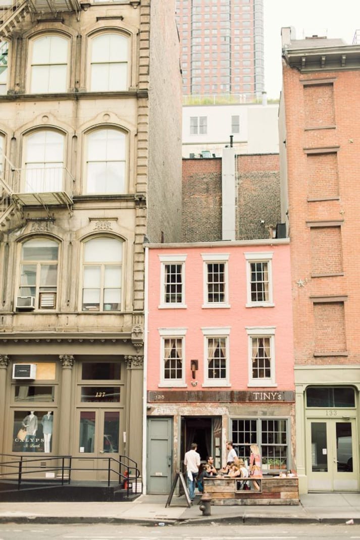
Facade and storefronts, are the first contact of the establishment with the client, have an intelligent design and an appropriate colour, will manage to attract the attention of the passer-by, and attract their attention.
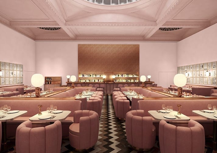
In the Horeca sector.
The pink universe is also possible in the world of hospitality and catering. As the work of interior designer India Mahdavi at The Gallery at Sketch in London shows. An example of how to be a transgressor without stridency, achieving a space that denotes delicacy and luxury.
PANTONE has also published a list of complementary colours that will be trending in spring 2016.
PEACH ECO (16-1548) warm and exotic; BUTTERCUP (12-0752) cheerful and bright; PARTY (17-1564) lively and powerful; SNORKEL BLUE (19-4049) deep and energetic; GREEN FLASH (15-0146) radiant and very urban; LIMPET SHELL (13-4810) suggestive and modern; LILAC GREY (16-3905) neutral and ICED COFFEE (15-1040) soft and elegant.